在hexo博客中使用ECharts图表
在hexo博客中使用ECharts图表
Dio云玩家简介
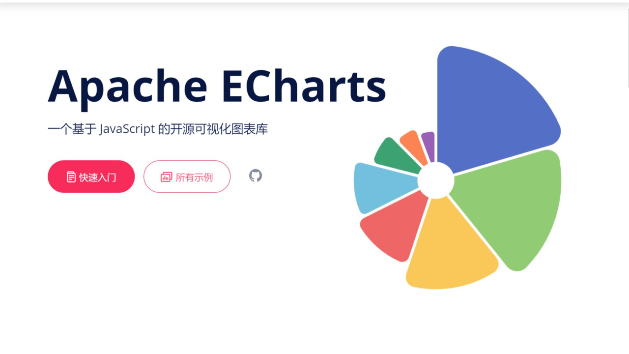
ECharts 是一个使用 JavaScript 实现的开源可视化库,涵盖各行业图表,满足各种需求。
ECharts 提供了丰富的图表类型和交互能力,使用户能够通过简单的配置生成各种各样的图表,包括但不限于折线图、柱状图、散点图、饼图、雷达图、地图等。
ECharts 遵循 Apache-2.0 开源协议,免费商用。
ECharts 兼容当前绝大部分浏览器(IE8/9/10/11,Chrome,Firefox,Safari等)及兼容多种设备,可随时随地任性展示。
在hexo博客中使用ECharts
安装ECharts插件
1
npm install hexo-tag-echarts --save
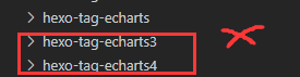
安装后会多出echarts3和echarts4插件,在blog插件目录(/node_modules)里删除这俩,三个都装会有冲突。

在需要ECharts的文章引入一次ECharts.js,复制粘贴到文章Markdown里就行,建议本地引入,CDN老是抽风 JS文件下载地址。
1
<script src="https://cdn.jsdelivr.net/npm/echarts@5.5.1/dist/echarts.min.js"></script>
之后在文章内使用 ECharts 的 Tag 就可以了。
1
2
3
{% echarts 400 '90%' %}
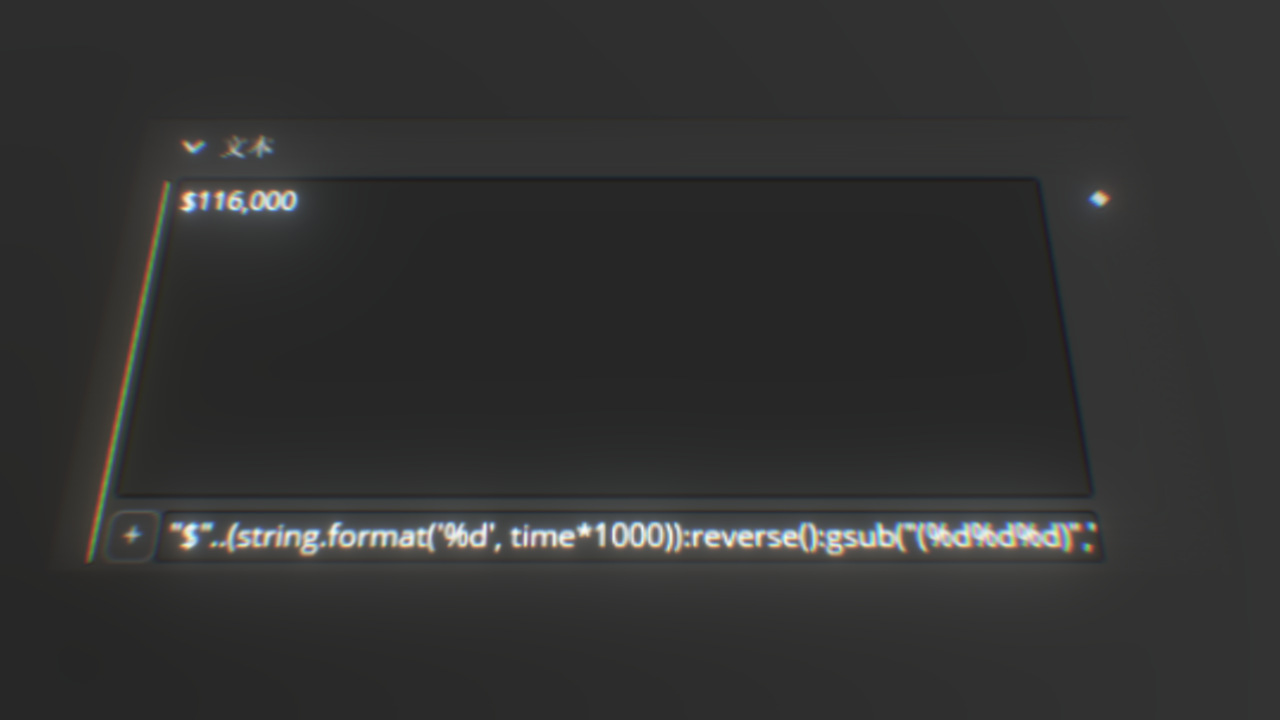
{% endecharts %}其中echarts是标签名endecharts是结束标签,400是图表容器的高度,默认是按正常比例缩放的,’90%’ 是图表容器的相对宽度,默认是81%。在标签之间的部分是ECharts中option里的内容,具体配置可以参考ECharts配置文档
举例
折线图
直接复制官方示例的代码到标签中https://echarts.apache.org/examples/zh/editor.html?c=line-simple1
2
3
4
5
6
7
8
9
10
11
12
13
14
15
16
17{% echarts 400 '100%' %}
{
xAxis: {
type: 'category',
data: ['Mon', 'Tue', 'Wed', 'Thu', 'Fri', 'Sat', 'Sun']
},
yAxis: {
type: 'value'
},
series: [
{
data: [150, 230, 224, 218, 135, 147, 260],
type: 'line'
}
]
};
{% endecharts %}极坐标柱状图
直接复制官方示例的代码到标签中https://echarts.apache.org/examples/zh/editor.html?c=polar-endAngle
1 | {% echarts 400 '100%' %} |
加載主題
- 在文章中引入主题JS文件,比如我的在本地就写作。主题文件在ECharts官方页面制作下载
1
<script src="/img/Games/dwrg/macarons.js"></script>
- 修改插件
You Blog: \node_modules\hexo-tag-echarts\echarts-template.html
修改html文件为You Blog: \node_modules\hexo-tag-echarts\index.js1
2
3
4
5
6
7
8
9
10
11<div id="<%- id %>" style="width: <%- width %>;height: <%- height %>px;margin: 0 auto"></div>
<script type="text/javascript">
// 基于准备好的dom,初始化echarts实例
var myChart = echarts.init(document.getElementById('<%- id %>'), '<%- theme %>' );
// 指定图表的配置项和数据
var option = <%= option %>
// 使用刚指定的配置项和数据显示图表。
myChart.setOption(option);
</script>1
2
3
4
5
6
7
8
9
10
11
12
13
14
15
16
17
18
19
20
21
22
23var fs = require('fs'),
path = require('path'),
_ = require('underscore');
var filePath = path.join(__dirname, 'echarts-template.html');
function echartsMaps(args, content) {
var template = fs.readFileSync(filePath).toString(),
options = {};
if (content.length) {
var options = content;
}
// Output into
return _.template(template)({
id: 'echarts' + ((Math.random() * 9999) | 0),
option: options,
height: args[0] || 400,
width: args[1] || '81%',
theme: args[2] || 'light'
});
}
hexo.extend.tag.register('echarts', echartsMaps, {
async: true,
ends: true
}); - 之后echarts标签就会多出一项主题项,默认有light和dark两种模式
由于我引入了新的主题macarons.js标签可以这样写。1
2
3
4
5
6
7
8
9
10
11
12
13
14
15
16
17
18
19
20
21
22
23
24
25
26
27
28
29
30
31{% echarts 400 '100%' macarons %}
{
legend: {},
tooltip: {},
dataset: {
source: [
['product', '2012', '2013', '2014', '2015'],
['Matcha Latte', 41.1, 30.4, 65.1, 53.3],
['Milk Tea', 86.5, 92.1, 85.7, 83.1],
['Cheese Cocoa', 24.1, 67.2, 79.5, 86.4]
]
},
xAxis: [
{ type: 'category', gridIndex: 0 },
{ type: 'category', gridIndex: 1 }
],
yAxis: [{ gridIndex: 0 }, { gridIndex: 1 }],
grid: [{ bottom: '55%' }, { top: '55%' }],
series: [
// These series are in the first grid.
{ type: 'bar', seriesLayoutBy: 'row' },
{ type: 'bar', seriesLayoutBy: 'row' },
{ type: 'bar', seriesLayoutBy: 'row' },
// These series are in the second grid.
{ type: 'bar', xAxisIndex: 1, yAxisIndex: 1 },
{ type: 'bar', xAxisIndex: 1, yAxisIndex: 1 },
{ type: 'bar', xAxisIndex: 1, yAxisIndex: 1 },
{ type: 'bar', xAxisIndex: 1, yAxisIndex: 1 }
]
};
{% endecharts %}
自定义主题:
默认主题:
暗色主题:
1 | {% echarts 400 '100%' dark %} |
结语
自己用这插件时也是踩了不少坑,毕竟我不是程序员出生不咋懂,希望能帮助到有需要的人。
更多的图表内容可以参考ECharts的官方示例